Code, sample, and insructions are provided "as-is". There are no warranties, guarantees, and no support for this free sample.
NOTE: If you are on a shared Hosting site and-or unable to edit code directly on your website, this may not work for you. Please do not try to use this code if you are unable to edit full Head and HTML code on your webite.
Demo
View the Demo - Responsive 3x3 Photo Panel ◹
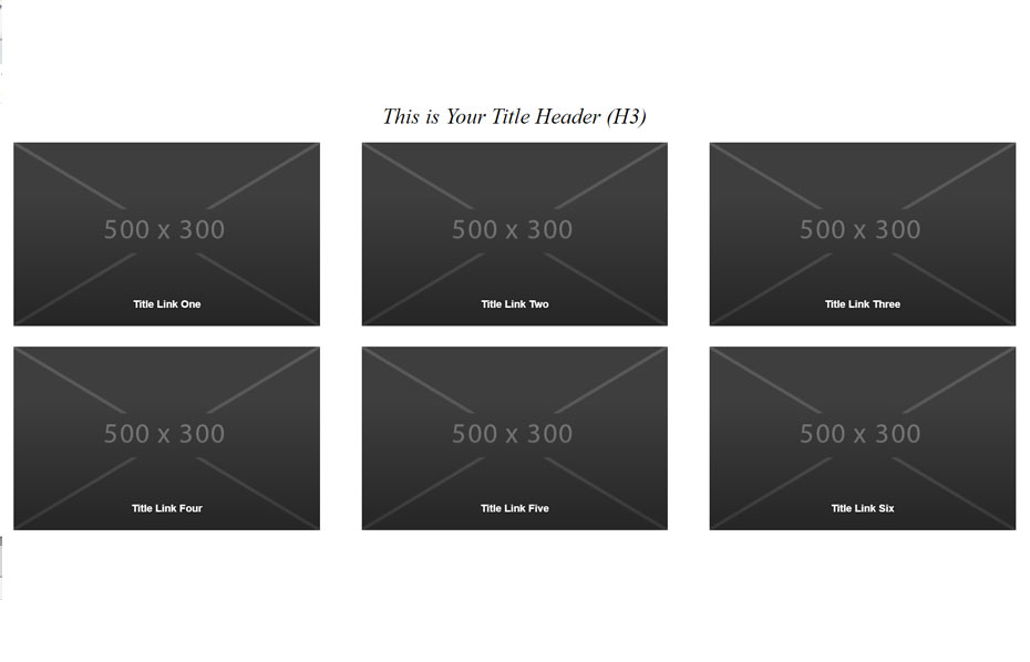
3 photo boxes by 3 photo boxes stacked with hover effect with each photo box linkable to a page or external website.
Primary styles will adapt to your styles if they are standard style-sets (IE: H1, H2, caption, body styles). The provided CSS style for this snippet will style the grid, hover, text color and links; all your top-level styles will look the same and will use your primary css styles for your website. If your primary css file is titled main.css, change the Photo Panel css filename (css/main.css) to css/photopanel.css) and change the css reference name in the html too.
Required:
- HTML code snppet
- css style main (css/main.css)
- css style oustyles (css/oustyles.css)
- Six (6) 500px by 300px images (images/photopanel)
Instructions
Download the zip file and unpack.
Your HTML file will need main and oustyles css files linked/added to your head tag.
<head>
<style src="css/main.css"></style>
<style src="css/oustyles.css"></style>
 </head>
 Add the HTML code snippet on your webpage where you want it to be displayed AFTER the Body tag.
Resize and add six (6) photos in the same location as in the package.
See the package for more details.
Download code-html-photopanel.zip